Best practices for sticky elements in UX design
Ensuring a great reader experience on your site is one of the most important drivers of higher RPM. Sticky elements — things that stay on screen as your reader interacts with the page — can have a big impact on...

Ensuring a great reader experience on your site is one of the most important drivers of higher RPM.
Sticky elements — things that stay on screen as your reader interacts with the page — can have a big impact on UX (user experience), especially on mobile devices without much screen real estate. They can also be the highest-earning types of ads.
So how do you optimize your content for both readability and revenue?
How much is too much when it comes to sticky content?
We’ll provide some guidelines to help keep your readers reading and your ad earnings high.
Issues with sticky elements
Spending any amount of time on the internet, you’ll come across pages that frustrate you with distractions. Pop-ups, sticky elements, difficult-to-read fonts, and inconsistent typography interfere with the site’s usability — and can subtract from your ad earnings.
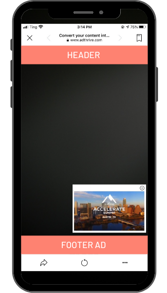
The highest-earning ads you can run on your site are a sticky footer ad and a sticky video player.
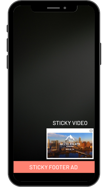
But when readers have too many things blocking the screen and interfering with what they’re trying to do, they close those ads and video players, causing those ad earnings to stop for that pageview.
When readers have an uncluttered experience, they leave the video player and sticky footer ad open. The longer those stay on the screen, the more they earn as new ads display.
On average, you’ll have 4x more opportunities to earn from a reader who leaves the sticky footer ad on screen than a reader who closes it right away. Similarly, if readers don’t close the sticky video player, it continues to show very high CPM video ads, driving up what you earn from that pageview.
Sticky UX is especially important on mobile
This is especially true for mobile users.
On desktop, larger screen space means the sticky ads are pretty far from the content, and as a result, rarely closed (the sticky video player is closed less than 10% of pageviews on desktop).
But on Android or iOS phones and tablets, limited real-estate demands that we rigorously examine each sticky element to ensure that it is earning the space it’s taking up.
Common uses for sticky elements
Google’s News Consumer Insights (NCI) has several suggested applications for sticky elements:
- Navigation
- Logo linking to the homepage
- Search
- Pay to Subscribe button
- Newsletter Subscription button
- Social Follow or Sharing button
- Call to Action Button
- Related Posts
There’s not enough mobile real estate to accomplish all of that. So prioritize, test and optimize.
Best practices for sticky elements: the Better Ads Standards
We’ve done extensive research, looking at UX on CafeMedia publisher sites, discussing UX with Google’s News Consumer Insights team, and consulting the Better Ads Standards. Across all of these sources, we found common themes, standards, and recommendations that can help a site owner achieve better UX and better ad earnings.
The Better Ads Standard requires that sticky ads don’t take up more than 30% of the screen on mobile.
Why that threshold? The Better Ads Standard was established using research from over 66,000 consumers. Their research showed that readers felt more frustrated when ads exceeded 30% of the screen on mobile.
A little UX psychology
Looking through data from thousands of CafeMedia sites, we can see user frustration (measured in how much the sticky video player gets closed) increase substantially on sites with more than 30% of mobile screens taken up by sticky elements.
In general, readers don’t care if a sticky element is an ad or not. They will close sticky video players and pop-ups containing regular content just as frequently as ad content if it is disruptive or distracting to their experience on a site.
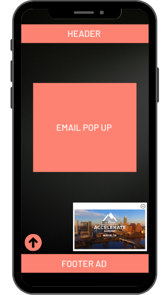
We see a strong correlation between sites with 30% or less of their screen taken up by sticky elements and increased ad earnings.
Field study on iPhone
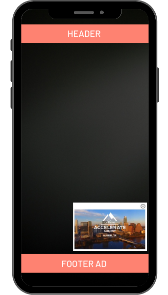
Some folks have mega-huge phones and others small phones, but on average, the standard old iPhone size is still average. Like the iPhone 6/7/8 (375 pixels x 667 pixels), smaller phones are a bit older, but the top 10 viewport sizes average out to within a couple of pixels of this size.
On a phone this size:
- A 50-pixel tall footer ad (our standard) takes up 7% of the screen
- A sticky video player without a video wrapper takes up 17% of the screen (272 pixels x 153 pixels)
- That leaves room for about one more 50px tall sticky element — and this is where your prioritization comes in.
Best practice: Remove the video wrapper
An essential key to preserving screen space is to use the sticky video player without the video wrapper title bar.
The video wrapper takes up an additional 4% of the screen, rarely receives clicks, and draws attention to the big X in the corner to close the video player.

Removing the video wrapper is the easiest way to reduce sticky clutter on your mobile site. Sites that remove it improve UX substantially, reducing the number of readers that close the sticky video player by one-third.
One-third of the readers who close a mobile video player when the title wrapper is present don’t close with the video wrapper removed. Removing the video title wrapper alleviates reader frustrations when viewing content.
That means video revenue improves by around 20% on mobile (or around 10% overall). And keeping the wrapper costs up to 10% of the revenue you could have from video.
Best practice: Keep your site’s sticky header small on mobile
Many themes have a header that sticks to the top of the screen as you scroll down that is much larger than 50pixels tall.
Sticky headers are often helpful for a good mobile user experience. But we often see these larger sticky areas drive up video play close rates because they shrink the screen’s visible area.
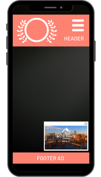
The best practice is to limit your sticky header to 50 pixels tall and make sure it disappears on scroll down and appears on scroll up, a Google NCI best practice. This way, it doesn’t interfere with readers as they’re reading your content.
But what elements do you feature in that 50px tall sticky header?
Best practice: Provide expected sticky header elements on mobile
1. Your logo. Readers expect a logo that links to the homepage. If you have more than a navigation menu, logo, and search bar in your site’s sticky header, the logo must be compact. (48 pixels x 48pixels). That allows it to fit comfortably in a 50-pixel tall sticky header, provide clear branding for your readers, and provide an easy way for readers to get to your homepage.
2. A “hamburger” menu. Most sites benefit from having a “hamburger menu” in the top left corner where readers expect to find a navigation experience.
3. A search function. Visitors also typically expect a search function, accessed either by opening up the navigation menu or on the top right of the screen.
4. There’s lots of room for experimentation. Using a compact logo should open up space for one additional button in your sticky header. This is an opportunity for a key call to action in your most valuable mobile real estate. Something that every reader will likely see.
Point readers to a related post or two. Ask them to sign up for your email list, follow you on social media, become a paying subscriber, or purchase your book. Identify what your most important sticky elements are and use them to drive your readers’ engagement.
Best practice: Use sticky elements sparingly
Don’t double up. Often we see a sticky “search” or “save” button in the site’s header and a second sticky “search” or “save” button covering part of the body of the text. Extra buttons contribute to clutter, making readers more likely to close your high-earning video and footer ads.
Best practice: Make sure a sticky element is necessary
1. Back to Top buttons. Remove any items that aren’t particularly useful, such as a “back to top” button. Scrolling is super easy, especially on a smartphone. A button for scrolling to the top costs 1% of your ad revenue. Is that worth it?
2. Cookie notices. If your cookie notice doesn’t shut off scripts that use cookies, it’s not doing much and probably doesn’t need to be sticky. It can live at the top of your site but doesn’t need to scroll down the page with your readers.
3. Desktop vs. Mobile. Remember that things that convert well on desktop may not view well on mobile, such as sticky-related post bars. You should consider when an in-content or end of post widget might achieve the same traffic benefit without hurting ad earnings on mobile platforms.
Finally, unnecessary sticky elements also contribute to accidental clicks. So, removing extra sticky content helps reduce the number of accidental clicks that Google sees.
Best practice: Remember your referral sources
Keep in mind where your readers are coming from to reach your site. If they’re coming from social media, Facebook & Pinterest often have sticky top & bottom elements that shrink the screen’s viewport even more.
That makes limiting sticky elements even more important! If most readers are coming to your site through social media, a sticky header, combined with the 70-100 pixels of sticky stuff that Pinterest & Facebook add to their apps, takes up too much space.
Making sticky decisions
Sticky elements are useful for reader navigation and driving advertising revenue from reader visits. However, too many elements can cause your readers confusion, especially from a bad mobile user experience.
For each sticky element on your site, ask whether it’s worth 1% of your ad earnings.
Consider how much value each sticky element brings and the potential ad earnings extra sticky elements create to find the perfect balance for your site’s usability and revenue potential.
Bio: James Baldwin
James focuses on making CafeMedia publishers as much money as possible. He serves the team that analyzes network data to help propel CafeMedia publisher income to the highest in the industry and oversees company-wide troubleshooting. Before coming to CafeMedia, James served as a project manager and consultant leading web, print, and video production efforts. He has a B.A. in Physics and lives in North Dakota with his wife, Susan and two little girls.